
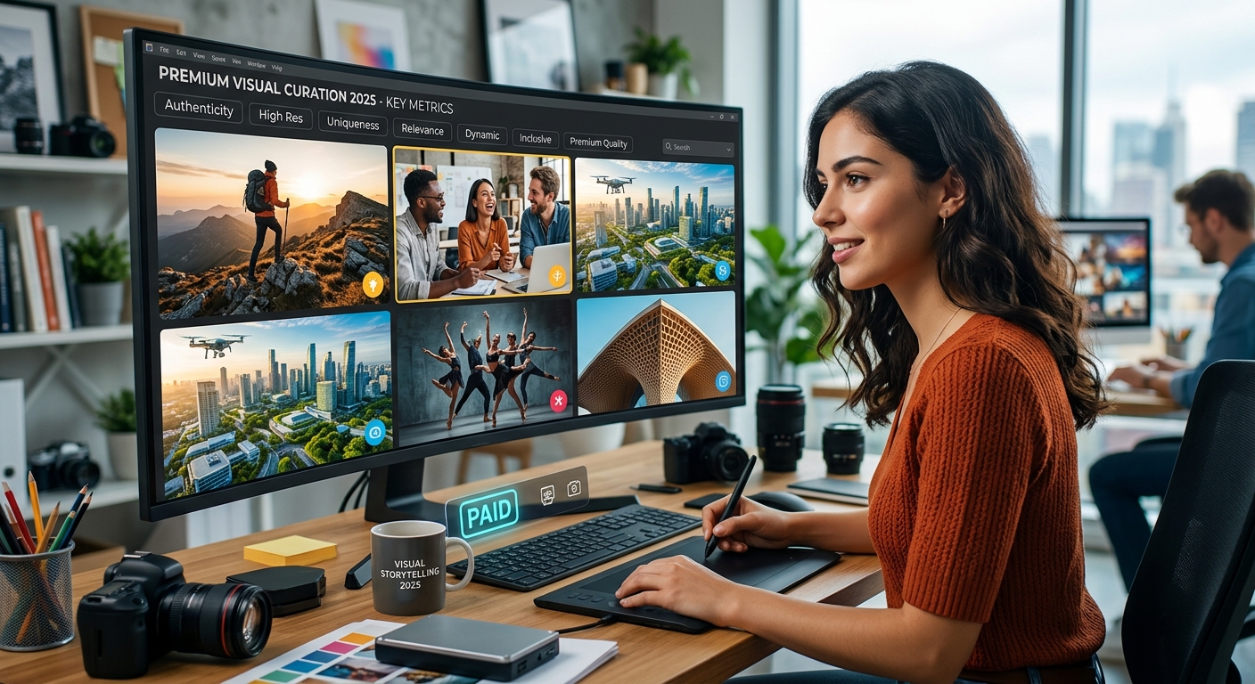
What Makes a Stock Photo Worth Paying For in 2025
The difference between a stock image that lands and one that gets used anyway is something most designers feel before they can explain it. You open a library, scroll through hundreds of options, and something in your gut says “this one works” while everything else just sits there. That instinct is real. It has a name: quality. And quality, in stock photography, is something you can learn to read fast once you know what to look for.
Paying for stock images is only worth it if you know what to ask of them.
- Lighting consistency separates professional shots from amateur ones, even when the subject matter is identical.
- Authentic expressions in people-focused images communicate credibility in ways that forced smiles never do.
- Clear licensing terms protect your project from costly takedown notices or retroactive rights claims.
The Honest Problem with Free Stock Libraries
Free stock platforms have gotten dramatically better over the past decade. Sites like Unsplash and Pexels host genuinely beautiful images, and nobody is saying they should be ignored entirely. But the distribution is uneven. For every clean, well-lit photograph with thoughtful composition, there are forty others that were uploaded because the barrier to entry was low, not because the shot was good. That math compounds fast when you are deep in a deadline and scanning hundreds of options.
The issue is not cost. The issue is curation. Free libraries are open to nearly anyone, which means quality control is largely crowd-sourced through popularity metrics. An image gets downloads and floats to the top. That does not mean it is the right image. It means it was useful to enough people that it circulated widely. Popularity and excellence are not the same thing, and treating them as equivalent is how design work ends up looking generic.
Paid platforms earn their price through editorial gatekeeping. Someone at the curation layer made a deliberate decision about each image before it reached the library. That decision-making process, applied consistently across thousands of files, is what you are actually paying for. Not just the image. The filtered result of a review process.
Lighting That Actually Holds Up Under Pressure
Lighting is the first place mediocre stock photography shows its age. Inconsistent light direction in a group shot. Harsh overhead fluorescents with no fill light to counterbalance. Window light that falls beautifully on one person and blows out the face of the person standing right next to them. These are not minor flaws. They are signals that the image was not made with professional discipline.
Professional stock photographers plan their shots around light because they know those images will live inside layouts, presentations, and advertising campaigns where everything needs to coexist visually. They shoot with a destination in mind. That kind of intentionality shows up in the final file, and it is almost impossible to fake in post-processing.
When reviewing an image for potential use, ask a simple question: does the light feel like it belongs to a real moment? If the answer requires hesitation, that image will likely fight with everything else on the page. The lighting needs to be neutral enough to travel across contexts, yet specific enough to feel grounded. That balance is a professional skill, not a happy accident.
What Authentic Expressions Actually Communicate
Stock photography has a reputation problem, and a lot of that reputation was earned by images of people grinning at laptops or shaking hands in front of white walls. Those images are not bad because they feature people. They are bad because the expressions are disconnected from any genuine emotional state. The subjects look like they are performing rather than existing.
Authentic expressions are harder to photograph than they look. They require direction, patience, and a subject who trusts the photographer enough to stop performing. When all three factors line up, the resulting image carries real weight. Viewers connect with it fast, often without consciously registering why.
For editorial content, marketing materials, or any design work that needs to build trust with an audience, that connection is not optional. It is the whole point of using photography instead of illustration. A paid collection that has been reviewed for this quality marker will consistently produce better outcomes than a free library where nobody is checking for it. The difference shows up clearly in finished designs.
Negative Space and the Designs That Actually Use It
Negative space is one of those qualities that separates a photograph taken to be looked at from one taken to be used. A clean expanse of sky, a neutral background, an out-of-focus foreground: these are not accidental. They are deliberate choices by a photographer who understood that the image needed room to breathe inside a layout.
Text overlays need somewhere to land. Logos need visual separation from the photographic content. A product shot needs a background that does not compete with the item being featured. When a photograph is composed with these practical realities in mind, it becomes a tool rather than just an image. The best paid stock libraries are full of images shot with exactly this kind of utility built in from the start.
Free libraries have fewer of these images not because photographers on those platforms are less skilled, but because composing for design utility requires thinking beyond the photograph itself. That awareness tends to correlate with professional experience, and professional experience tends to correlate with paid markets. It is that direct.
Where Paid Collections Pull Ahead: A Direct Comparison
Free vs. Paid: What the Quality Gap Looks Like in Practice
| Quality Marker | Free Platforms | Paid / Curated Collections |
|---|---|---|
| Lighting consistency | Variable, often unreviewed | Reviewed before publishing |
| Expression authenticity | Inconsistent across the library | Higher standard through editorial review |
| Negative space for layouts | Rare, coincidental | Often composed intentionally |
| License clarity | Basic, sometimes vague | Detailed, with indemnification options |
| Model release documentation | Not always verified | Typically required before acceptance |
Paid stock libraries earn their fee primarily through editorial control. Every image in a curated tier has been reviewed for technical quality, model release compliance, and aesthetic consistency. That review process filters out the bulk of what would otherwise feel like filler. The numbers in the table above are not hypothetical. They reflect documented curatorial practices that vary in a predictable direction.
Evaluating whether a paid subscription makes sense for a specific project is something you can do concretely. Browsing premium stock images from a curated tier puts the editorial gatekeeping on full display in minutes. The gap between that experience and a comparable free search tends to be striking enough to inform budget decisions on its own.
Licensing Is the Part Nobody Reads Until It Matters
Stock photo licensing is genuinely complicated, and most designers do not think about it until they receive a notice. The distinction between royalty-free and rights-managed, between editorial use and commercial use, between standard licenses and extended licenses: these are not technicalities. They determine what you can legally do with an image and for how long.
The federal copyright framework for visual works governs how image rights are structured, what protections apply to creators, and what falls outside those protections for licensees. Understanding these basics before you source an image is less work than addressing a licensing dispute after the fact. And disputes do happen, especially on commercial projects with wide distribution.
Paid stock platforms typically include clearer licensing terms, indemnification clauses, and model release documentation than free alternatives. That documentation matters when a client asks whether an image was properly cleared for a national advertising campaign. It also matters when a usage dispute surfaces two years after a project closes and you need paper trails to back up your sourcing decisions.
Measuring Your Current Sources Against the Work They Need to Do
The argument for paid stock is not that free stock is bad. It is that the time spent sorting through low-quality options on a free platform has a real cost. Every minute spent filtering out blown-out exposures, stiff expressions, and cluttered compositions is a minute not spent on the actual design work. That time adds up across a project, and across a year it adds up significantly.
Count how many images you review before finding one you can actually use on a given search. Track how many times you have settled for a second-choice image because the first-choice was unavailable or behind a license tier you had not budgeted for. That data tells you something concrete about whether your current approach is as efficient as you think it is.
The composition standards and licensing practices this site regularly critiques exist because the gap between adequate and genuinely useful is where most design budgets quietly lose ground. Auditing your image library against markers like lighting discipline, expression quality, compositional intent, and licensing transparency gives you a realistic picture of what you are actually paying for, whether that payment is money, time, or both. The best stock photo for your project is rarely the first one you find. It is the one that was made with your project in mind, even if the photographer never knew it existed.