
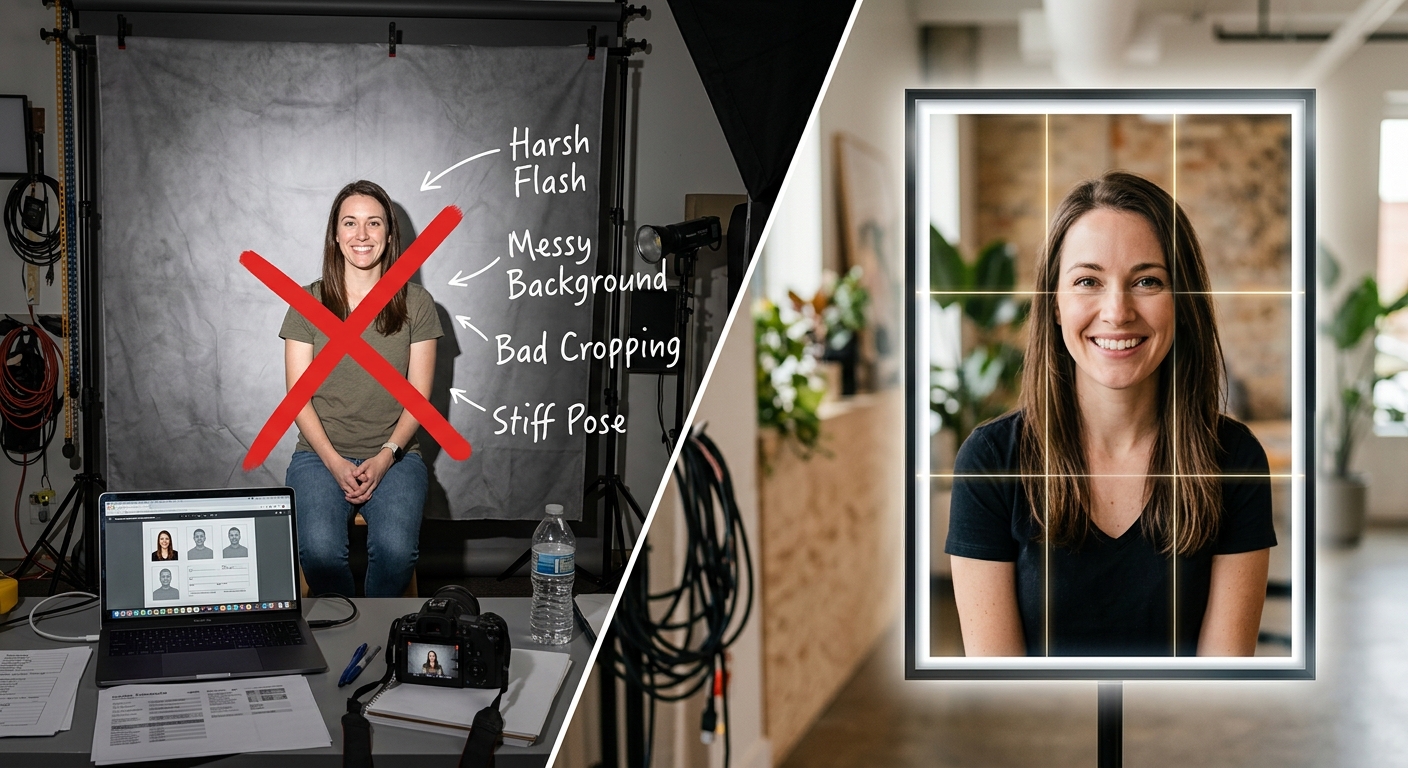
Why ID-Style Stock Photos So Often Fail Composition Standards
Stock agencies reject ID-style portraits at a rate that surprises most contributors. The images look fine to an untrained eye. Clean background, centered face, neutral expression. But underneath that surface-level tidiness sits a dense set of technical rules that most photographers have never studied. Agencies built their rejection criteria around international documentation standards, and those standards care about millimeters, luminance values, and shadow angles. Artistic judgment does not enter the calculation.
Rejection at a Glance
- Background luminance outside the narrow neutral-white window is the leading rejection trigger across all ID-style stock categories.
- Head-to-frame ratios outside the 70 to 80 percent range make portraits unusable for documentation-adjacent licensing.
- Lighting imbalance between key and fill sources creates shadow artifacts that flag images before a human reviewer even reaches the face.
The Technical Bar Is Higher Than Most Photographers Expect
ID-style portrait photography sits at the intersection of studio craft and technical compliance. Most photographers approach it like any other headshot assignment. They center the face, pull out a white backdrop, and call it done. That approach misses the point entirely.
Agencies selling in documentation-adjacent categories evaluate submissions against specifications borrowed directly from biometric passport standards. Those standards define exactly what a compliant facial image must look like in terms of geometry, illumination, color rendering, and background neutrality. When photographers submit without studying these benchmarks, rejection is almost guaranteed.
The failure rate here is rarely about skill. A technically gifted photographer who has never read an ID photo specification will produce images that look polished but collapse under measurement. The gap between “looks right” and “passes agency review” is much wider than most contributors expect when they first enter this category.
Background Tone Gets Photographers Rejected More Than Anything Else
The background problem sounds easy to solve. Use a white background. Done. Except white is not one value. In photography, white spans a wide luminance range, and the acceptable window for ID-style stock work is narrow.
Backgrounds that render too warm read as cream or off-white under studio lights. Agencies flag these immediately. Backgrounds that pick up a cool cast from daylight-balanced strobes read as pale gray or faintly blue on calibrated monitors. Those get flagged too. The target is a neutral, even-toned background that reads as true white on every calibrated display in the reviewer’s workflow.
Gradients are the other major failure point. A background that reads correctly at center but darkens toward the edges is technically a gradient background, even when the difference is subtle to the naked eye. Post-processing luminance masks and fill-card positioning during the shoot both factor in here. Light falloff within just a meter of the backdrop frame is much greater than most photographers account for.
Colored backgrounds create a separate category of rejections. Some documentation contexts allow light gray or specific blue tones. But stock agencies with general-purpose ID categories do not accept colored backgrounds unless the image is labeled specifically for a market that requires them. Submitting a blue-background portrait to a general stock library without accurate metadata will result in rejection regardless of technical quality.
Head-to-Frame Ratios and Why Getting Them Wrong Kills a Shot
Head-to-frame ratio is one of the most commonly misunderstood technical requirements in ID photography. The rule is straightforward in principle. The face, measured from chin to crown, should occupy a specific percentage of the total frame height. Most international specifications sit between 70 and 80 percent, which aligns closely with the official passport photo specifications published for US travel document applications.
In practice, photographers either crop too tight or leave too much headroom. Too tight means the crown clips the top of the frame or the chin sits dangerously close to the bottom edge. Too loose means the face appears small against a wide expanse of background, failing the ratio at the other extreme.
These errors are easy to make because viewfinders and LCD screens distort perceived proportions during capture. A shot that looks well-framed in the moment often reveals its ratio errors in post when the image is measured against actual pixel dimensions. Shooting slightly looser and cropping in post helps, but it sacrifices resolution.
Several specific issues push ratio compliance off track:
- Shooting at the wrong focal length introduces barrel or pincushion distortion that stretches perceived head size against the frame
- Tilted heads shift the effective chin-to-crown measurement even when the subject appears centered in the viewfinder
- Very dense or voluminous hair creates ambiguity around where the crown ends for measurement purposes
- Slouched posture changes where the chin sits relative to the frame bottom and throws off the ratio calculation entirely
Lighting Flaws That Flag an Image Before a Reviewer Sees the Face
Flat lighting sounds safe. It removes shadows and creates even illumination across the face. But flat lighting is not the same as compliant lighting, and the distinction matters significantly in this category.
Compliant ID lighting requires even illumination across both sides of the face with no significant shadow variation between left and right cheek. It also requires the background to receive consistent light, rendering it as even white without hotspots or dark corners. Flat lighting applied carelessly still produces visible catch-light reflections in the wrong positions, uneven shadow under the chin, and specular highlights on the forehead that blow out to pure white and lose surface texture.
Mismatched lighting is a separate failure type. This happens when a key light renders skin at one color temperature while a fill light or ambient source sits at a different temperature. The result is a face with warm highlights and cool shadows, or vice versa. On a calibrated monitor this reads as wrong immediately. Agencies treat it as a processing artifact or a technical error, and the image fails review.
Shadow under the nose is the single most-cited lighting failure in ID portrait review. A light position even a few degrees too high creates a shadow between the base of the nose and the upper lip. Documentation standards require this area to be clearly visible, and that shadow creates an automatic rejection flag across virtually every ID-adjacent stock category.
How Photographers Prep Subjects Before the Shoot
Prepping a subject for an ID-style session starts well before the studio appointment. Subjects need to understand what the finished image is supposed to look like. Explaining technical specs verbally often fails because most people have no reference point for phrases like “head-to-frame ratio” or “shadow gradient.”
A practical approach is to give subjects a visual baseline before they arrive. Running a casual phone photo through an AI ID photo maker generates a compliant reference image that the subject can study in advance, giving them a clear mental picture of the required framing, expression, and background tone before they ever step in front of a studio light.
Beyond the visual reference, subject positioning during the shoot matters enormously. Photographers often underestimate how much subjects shift between initial setup and actual capture. Even a small forward lean changes the focal plane and alters the perceived ratio. A chin rest or positioning marker helps keep subjects locked to a consistent distance from the lens across multiple frames.
Hair management is another preparation step that gets overlooked consistently. Loose hair obscuring the ears, forehead, or jawline creates ambiguity in the framing measurement. Most documentation photography requires that ears remain visible, so flyaways and voluminous styles need to be addressed before the session starts, not corrected in post.
Eyewear is worth discussing in advance. Glasses create glare under studio lighting, and many stock libraries will not accept ID-style portraits with visible lens reflections. Subjects who wear glasses regularly should either remove them for the shoot or plan a session specifically designed around anti-reflective studio setups.
The Details Reviewers Actually Catch on a Second Look
A reviewer who clears the initial pass on ratio and background will examine everything else closely. Several specific details get flagged consistently at this second level of review:
- Catch lights positioned outside the natural iris zone read as artificial or heavily retouched and draw additional scrutiny from senior reviewers
- Skin retouching that removes visible pores makes the texture look painted and triggers a post-processing review flag
- Collar or neckline edges that clip into the background without clear separation make it difficult to isolate the subject for documentation use
- Eyes that are not fully open or that show directional gaze other than straight-on fail biometric compliance checks across most agencies
- Stray hairs against a white background create dark edge artifacts that automated review tools can mistake for sensor dust
These issues do not appear during capture. They surface on a calibrated monitor during post-processing review. Photographers who skip calibrated display work and submit straight from an uncalibrated laptop screen consistently miss these flags and wonder why technically clean images keep coming back as rejected.
Why Consistent ID Photo Quality Connects to Broader Model Release Practices
Stock agencies treat ID-style portraits differently from other portrait categories, and not just because of the technical specifications. A recognizable face against a plain white background in a formal, neutral pose reads as documentation-adjacent to both agencies and buyers. That classification carries real implications for how the image gets used downstream.
That classification also triggers stricter model release requirements. Agencies want confirmation that the subject understood the specific use context. A general portrait release may not be sufficient for an ID-style image sold into medical, legal, or government-adjacent markets. The face must be paired with a release that specifically addresses the documentation-style use context and the intended buyer categories attached to it.
Photographers who build clean, technically compliant ID portfolios often find that model release documentation becomes the next bottleneck. Getting composition right is the first step. Having a release that matches the intended use category is the second. Agencies that accept technically flawless ID portraits still reject submissions when the attached release does not cover the specific use category the image is being submitted under. These two problems are almost always solved separately, and that gap costs contributors accepted images they could otherwise be earning from.
Where Precision in the Frame Meets Precision in the Paperwork
ID-style portraits are among the most technically unforgiving categories in stock photography. The margin for error is small. The reviewer’s checklist is long. The gap between an image that looks compliant on a phone screen and one that passes agency review on a calibrated display is surprisingly wide, and the gap between an accepted image and a usable licensed asset includes the model release documentation sitting behind it.
Photographers who invest time in understanding background luminance requirements, head-to-frame ratio specifications, and lighting balance standards before they shoot consistently produce more submissions that clear review. Those who rely on instinct and assume “it looks right to me” produce folders full of near-misses that never convert to accepted images or licensing revenue.
The path forward requires studying the actual specifications, prepping subjects with visual references before they arrive, shooting on calibrated equipment, reviewing on calibrated displays, and pairing every submission with a model release that matches the intended use context. That process does not guarantee acceptance. But it eliminates the most common reasons agencies send ID-style portraits back without a second look, and in this category, eliminating avoidable failures is most of the work.